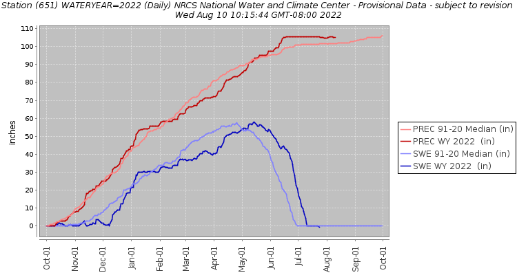
To see how SWE changes through the year at a single SNOTEL site, the 30-Year Normals graphs are useful. These graphs show annual observations for the previous 30-year period, allowing users to compare historical observations with current and previous years. An example from one SNOTEL site is shown below. These graphs, which are updated every 10 years, quantify how SWE compares with previous 30-year periods. The 30-year normals measure a water year—each gray line on the graph represents one water year during the 30-year period; the red line is the median.
This graph allows us to identify important metrics for snow. The first is the peak of the graph, or the maximum amount of water stored in snowpack during the water year. This peak indicates how much water may be available to melt into streams in the spring and summer, information that water resource managers use to decide how much water can be allocated to various uses. If the peak of SWE is less than normal, this indicates snow drought. It is possible that the same amount of precipitation fell during the winter, but precipitation that falls as rain is not held in the snowpack, and water shortages may occur later in the year.
Other important metrics for water availability shown on this graph are timing of melt, rate of melt, timing of peak snowpack, and volume of snowpack throughout the winter. Also shown are SWE onset date and melt date, which measure season length and water availability. Knowing how these metrics change over time can provide input to winter recreation management. It is also important for plant and animal management, as changes in length of snow cover could cause a shift in the species that live in an area.

Two other metrics are related to the timing of snow melt in the spring – when snow starts to melt and when snow finishes melting (the melt-out date). In the Northwest, farmers rely on snowmelt to water their crops, and aquatic species such as steelhead and salmon rely on snowmelt to keep streams cool and provide water late into the summer. In streams and rivers that rely on slow snowmelt in the spring and summer, changes in the timing of melt may bring too much water at once to man-made reservoirs or lead to flooding.
For more information, visit the normals website to explore graphs and download consolidated data for SNOTEL sites or regions. To view and download data for multiple years at a time, the USDA has graphs available for Oregon, Washington, Idaho, and Alaska. Graphs can be viewed by clicking on the “.html” file for the site of interest, and years can be turned “on” or “off” by clicking on them in the legend.
List of active SNOTEL sites that have downloadable current and historic data:
-

Snow is a critical source of water in the Northwest, and climate change will affect its availability.
-

Allow users to track snow and total precipitation and compare them to historic medians.


